Jim Harris Talks About Illustrating...

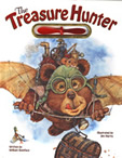
The Treasure Hunter
This is a fictional story. I must tell you that right from the start. It would be very easy to get confused about this, but just so we are clear…
#1 There is no such thing as a “stratosphere blimp.”

#2 Pirate ships do not really disappear off Jamaica’s coast like ghosts.

#3 Mermaid queens don’t really have treasure chests brimming with jewels.

And #4 If a princess from Siam drops her purse in a volcano… we DO NOT REALLY RECOMMEND that you climb into the volcano to get it!

Now if we’ve got that straight… I feel a little more comfortable about telling you about the pictures… which I admit make it LOOK like everything is absolutely, positively, completely true. (Well, OK, the mouse sailing along on the end of the pilot’s scarf is a little far-fetched… but everything else, I mean.)

Artistically speaking, there are a few tricks you can use to help your paintings look realistic. You can…
Use Overlapping to Make Paintings Look Realistic
Overlapping is where you can’t see all of an object, because some other object is partly covering it. This makes the object that’s partly hidden look like its FARTHER BACK. This is really helpful for us artists because when you’re slapping paint on a piece of paper the actual fact of the matter is that it’s all exactly the SAME DISTANCE from your eyeballs. But this little technique helps you get some objects to look closer up and other things to look farther away.
Here’s an example of what I mean…

This is the most excellent Treasure Hunter having a chat with a lady who lives in a shoe. Yes, I know, it’s a “different” housing option … but we mustn’t criticize other people’s choices. Anyway, you’ll notice that there are little bear kids all over this scene and overlapping is what helps us recognize which ones are closer.
The bears on the tire swing are closer than the Treasure Hunter’s pedal-copter because they overlap the pedal-copter a little bit. The girl with the purple bow is farther back than the shoe, because the shoe overlaps her. Etc. etc.
Here’s a second way to make your paintings look more realistic:
Use positioning to make objects look closer or more distant.
If you paint an object up toward the TOP of the page… it will usually look farther away. See this picture of Mr. Treasure Hunter vacuuming up gold out in space …

Here hunks of gold rocks are floating all over the place, but the ones higher up on the page seem farther away. For some reason our minds process images this way, and you can use this to your advantage when you WANT something to look farther away.
Here’s another example …

Here the Princess of Siam is busy flirting with the Treasure Hunter (who DID rescue her purse, after all -- which is significantly more than her beefy bodyguards managed to do) and a volcano is erupting in the background. Now it’s true we can tell the volcano is in the background because it’s being overlapped by the helicopter, but it’s also important that the volcano and its mountain range are painted HIGHER UP on the paper – closer to the TOP of the paper—which tells our brains that it’s WAY OUT THERE.
By the same token, Monsieur Mouse is right down at the bottom of the paper and that tells us what? He is real CLOSE TO US.
I think you’ve got the point. Now it takes a while to organize all this on a brand-new painting… but it is well worth the time. If you haven’t already, you should try it!
P.S. One more thing you should know about this book…

For your information, Egyptian mummies do not really leave hieroglyphic “Out to Lunch” signs. If you see something like this in real life… you will know it is a feeble hoax… or it could be a mirage… or (best of all) you have just accidentally invented space/time travel. In which case I hope you will drop me a line about it… and give me a few pointers…as I have always hoped for a chance to try it myself.
Images and Text © 2009 Jim Harris. All Rights Reserved

